Okay, I just have to ask: does anyone actually look at the collages in these recaps? I have my doubts. They certainly take time to produce (though Adobe Express takes most of the grunt work out of it). But as our own Annie Witchway points out, they also leave a lot to be desired from a marketing perspective. They certainly don't "pop" the way our birthday updates do!
One alternative I've considered is simply to select a couple scenes to highlight for each recap, just as we do for the birthday updates—but with so many great contributions each week, that feels too restrictive and not exactly fair.
Another would be to start using animated GIFs on the front page, instead of collages. I love how this looks in testing, but it also would dramatically increase the weight and load time of a front page that is already pushing the boundaries in that regard—unless we were to use "infinite scroll" (which has some technical issues) or split the front-page features among multiple pages (which at some point we'll presumably need to do anyway).
We'd love to hear your thoughts, but for now, enjoy this week's scenes from Canada, France, Germany, Indonesia, Mexico, Sweden, Turkey, UK, and the USA. And stay tuned next week for a very special front-page feature that comes with its own technical improvement to the site!

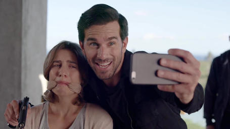

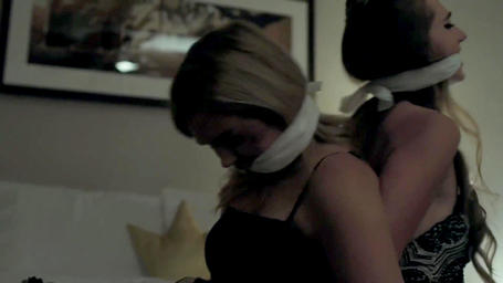
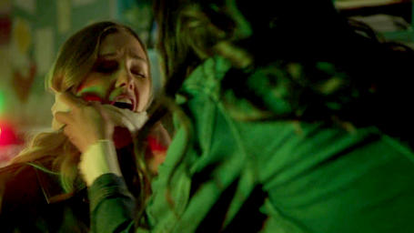
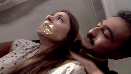
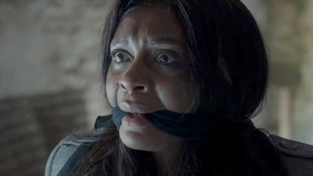
![Daredevils Of The Red Circle (1939) - S01E12 [colorized]](/sites/default/files/styles/clip_teaser_image/public/screencaps/Daredevils%20Of%20The%20Red%20Circle%20%281939%29%20-%20S01E12%20%5Bcolorized%5D%20-%20cover.jpg?itok=Lad55uG8)
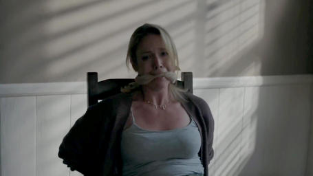
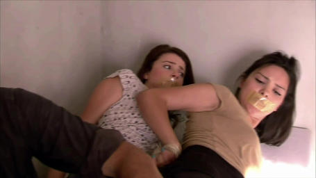
![Irene Huss (2007) - S02E02 - Det lomska natet [Esther Falemark] - cover.jpg](/sites/default/files/styles/clip_teaser_image/public/screencaps/Irene%20Huss%20%282007%29%20-%20S02E02%20-%20Det%20lomska%20natet%20%5BEsther%20Falemark%5D/Irene%20Huss%20%282007%29%20-%20S02E02%20-%20Det%20lomska%20natet%20%5BEsther%20Falemark%5D%20-%20cover.jpg?itok=hXUzXLP0)
![Irene Huss (2007) - S02E02 - Det lomska natet [Tind Soneby] - cover.jpg](/sites/default/files/styles/clip_teaser_image/public/screencaps/Irene%20Huss%20%282007%29%20-%20S02E02%20-%20Det%20lomska%20natet%20%5BTind%20Soneby%5D/Irene%20Huss%20%282007%29%20-%20S02E02%20-%20Det%20lomska%20natet%20%5BTind%20Soneby%5D%20-%20cover.jpg?itok=RhMJtHnd)



Join the discussion